White. A blank page or canvas. The challenge: bring order to the whole. Through design. Composition. Tension. Balance. Light. And harmony. —Sunday in the Park with George
There are a lot of reasons to love pocket scrapbooking. First of all, our friend Becky Higgins is a genius and we admire her for her creativity, practicality and her keen sense as a businesswoman. Pocket scrapbooking is fun, fast and gets the job done with flair.
And, for us lovers of traditional 12×12 layouts, pocket scrapbooking can teach us a lot about how to pull together a beautiful layout that’s clean, simple, elegant and quick.
Principle #1: Work with 2 main elements
Pocket scrapbooking involves two main elements: the filler cards and our photos. So, in creating our 12×12 layout, we will think of our layout as having 2 main layers, the background and the foreground. As with the core kits we work with in pocket scrapbooking, the paper we choose as our base will tell us a lot about how to proceed. Patterns with sweeping, curvy lines suggest curves, while patterns with straighter lines don’t. Simple, unpatterned cardstock suggests simple elegance. Bold, bright colors suggest bold, statement layouts, and soft, muted tones suggest softer lines. So, when we choose our base paper, we need to keep in mind the photos (or kinds of photos) that we will be putting on it. Their dominate colors and lines will should be supported by our base paper.
Once we have a match between the colors and mood of our pictures and the colors and mood of our base paper, the rest is glitter (as we say in the papercrafting biz).
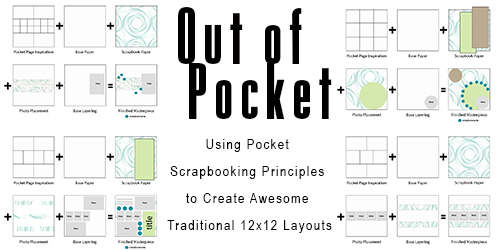
Principle #2: Think Geometry
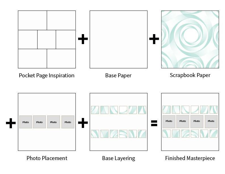
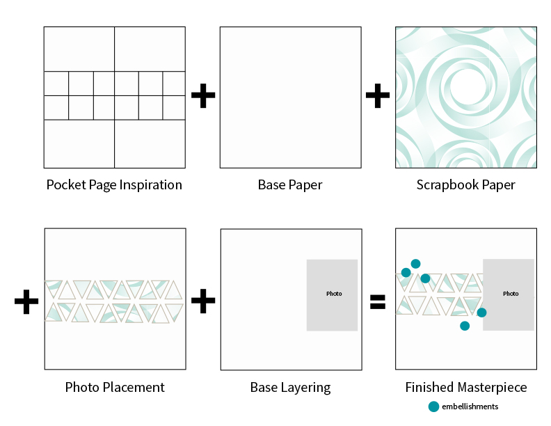
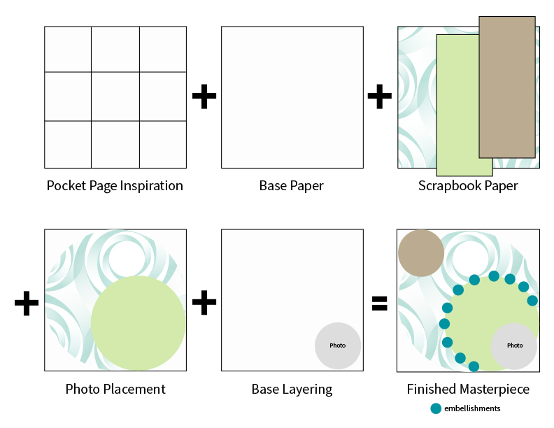
Don’t panic. No proofs here! In pocket scrapbooking, the pockets break the page down into workable chunks (that are also the most basic geometric shapes: squares and rectangles.) So, we just need to look to a pocket page pattern for inspiration and see which shapes come to mind. But we are certainly not limited to squares and circles! Here are some examples:
We saw squares and we designed this:
We saw rectangles and we designed this:

We saw tiny triangles and we designed this:
We saw circles and we designed this:
Principle #3: Keep your color scheme tight
Pocket scrapbooking core kits use a really tight color scheme, which is great because it takes the guesswork out of creating a coordinated layout. And it’s just as easy to use this principle in a 12×12 layout. We use 3 main strategies when choosing our layout color schemes:
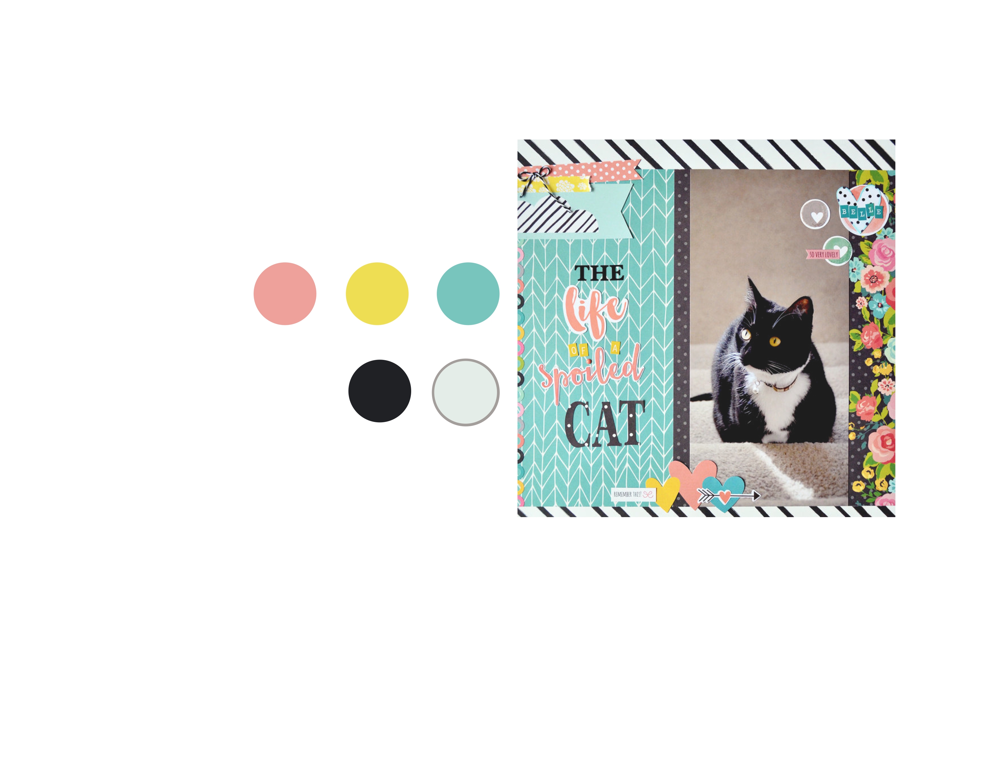
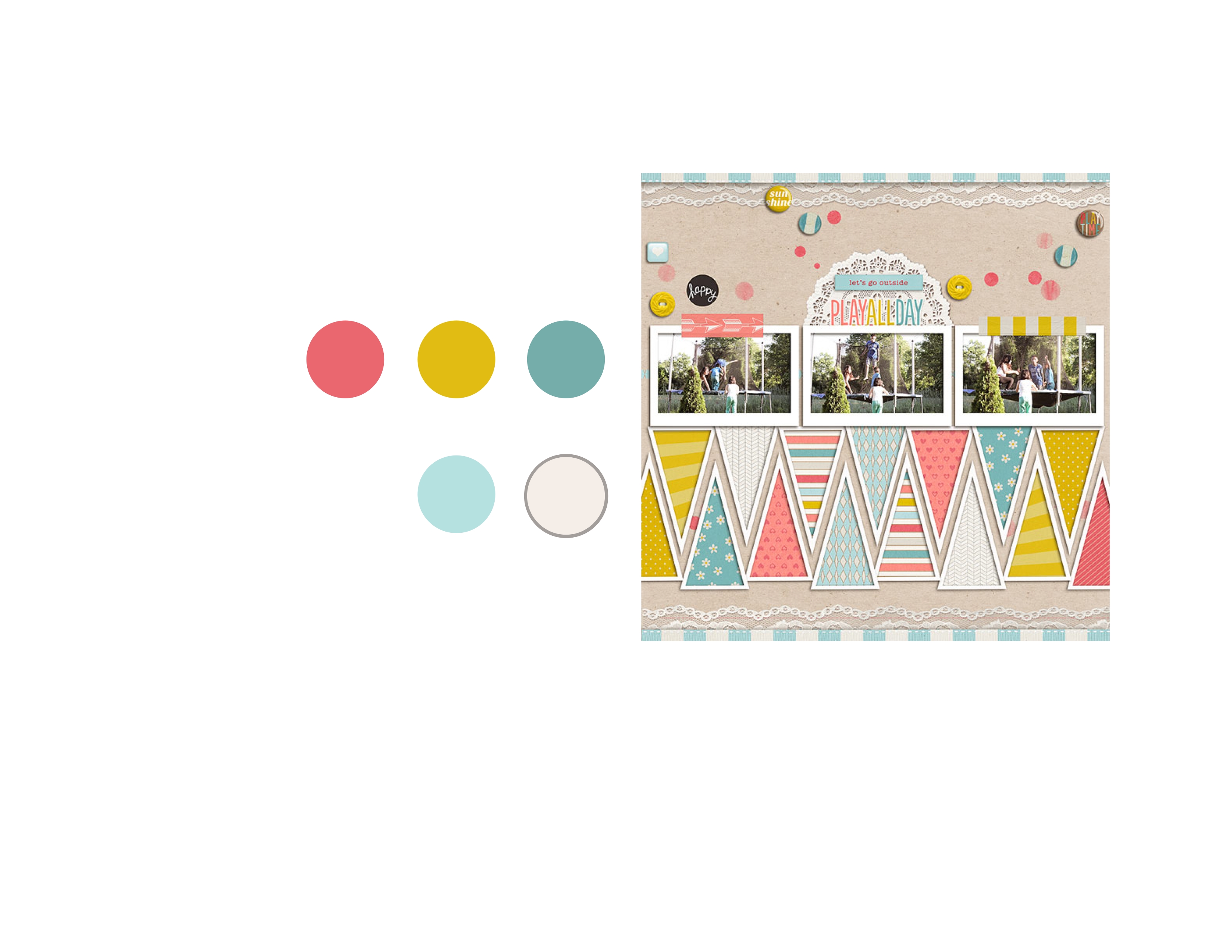
Use 3 main colors and 2 highlighting colors (or 5 and 2 or 7 and 2–the important thing is, to create a visually balanced and interesting layout, use an odd number of main colors and usually 2 highlighting colors, which adds up to an odd number of colors overall. Always use an odd number. That creates the tension that George is talking about in the quote above.) Here are some examples:
|
|
|
|
|
|
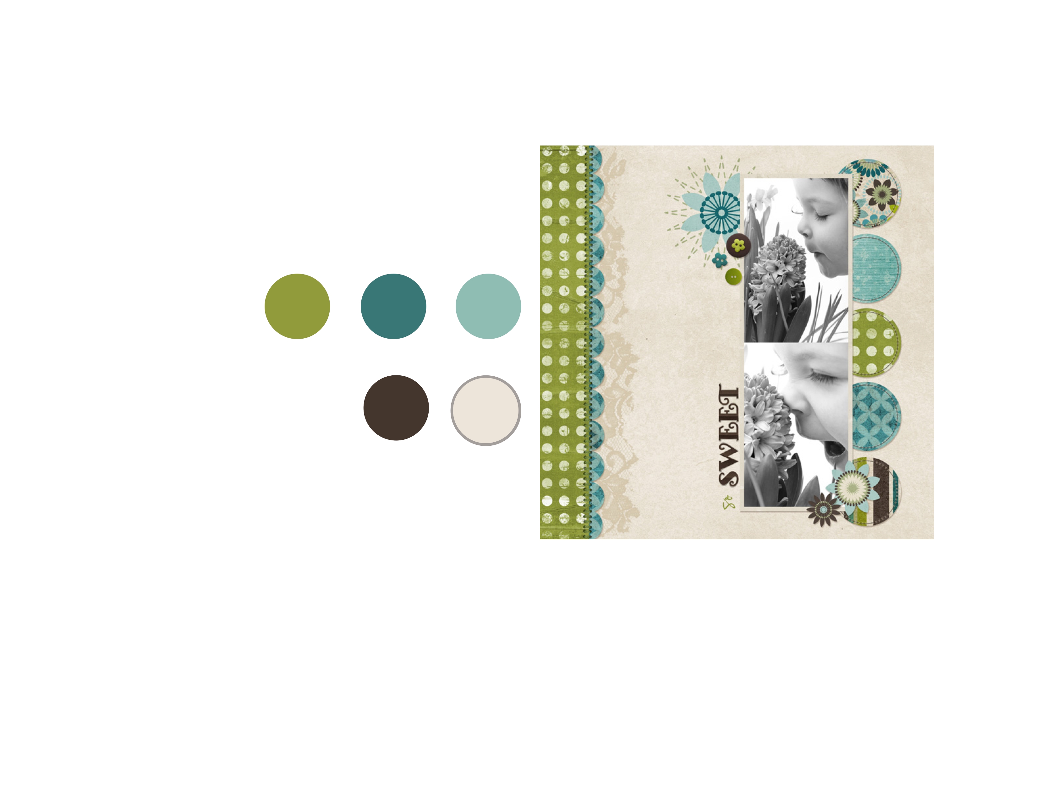
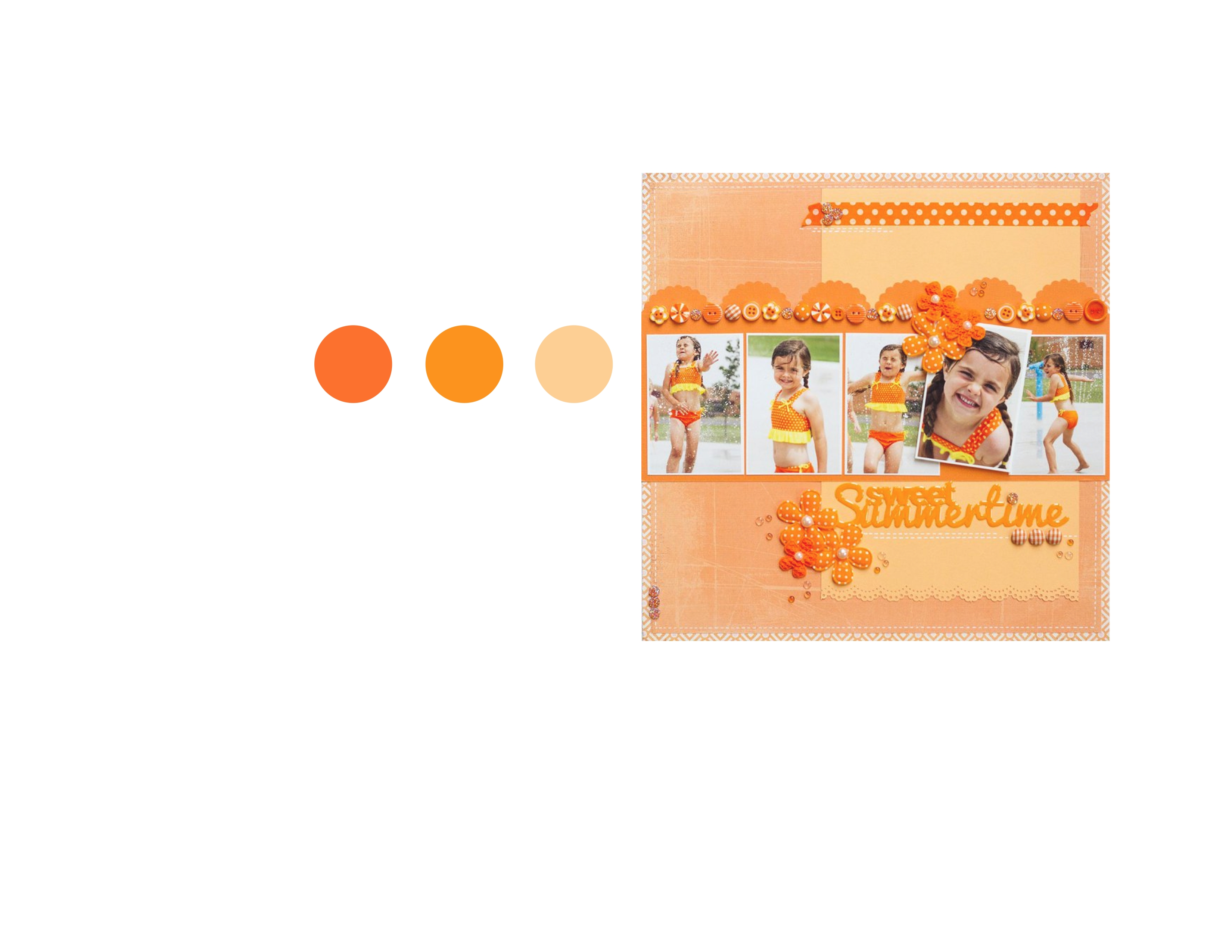
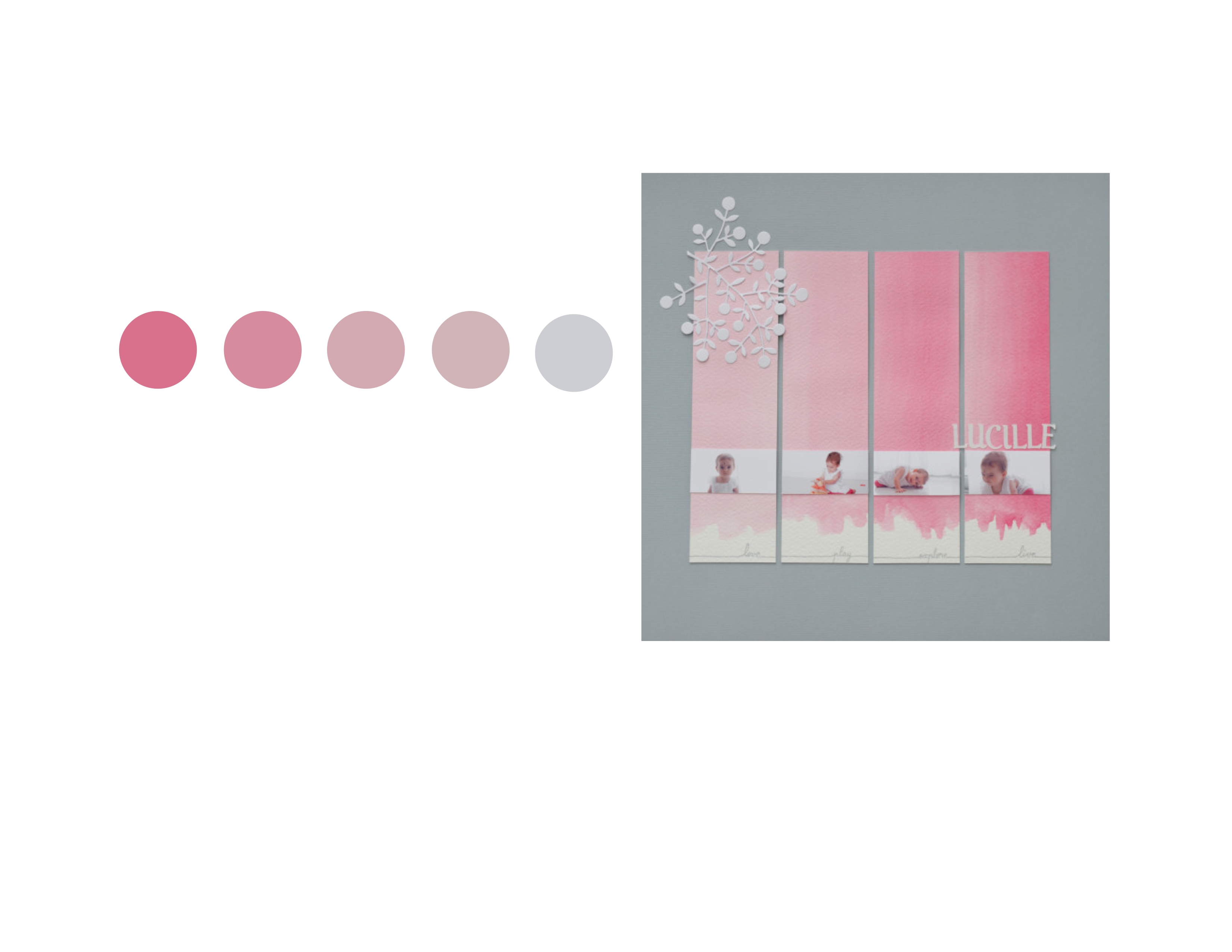
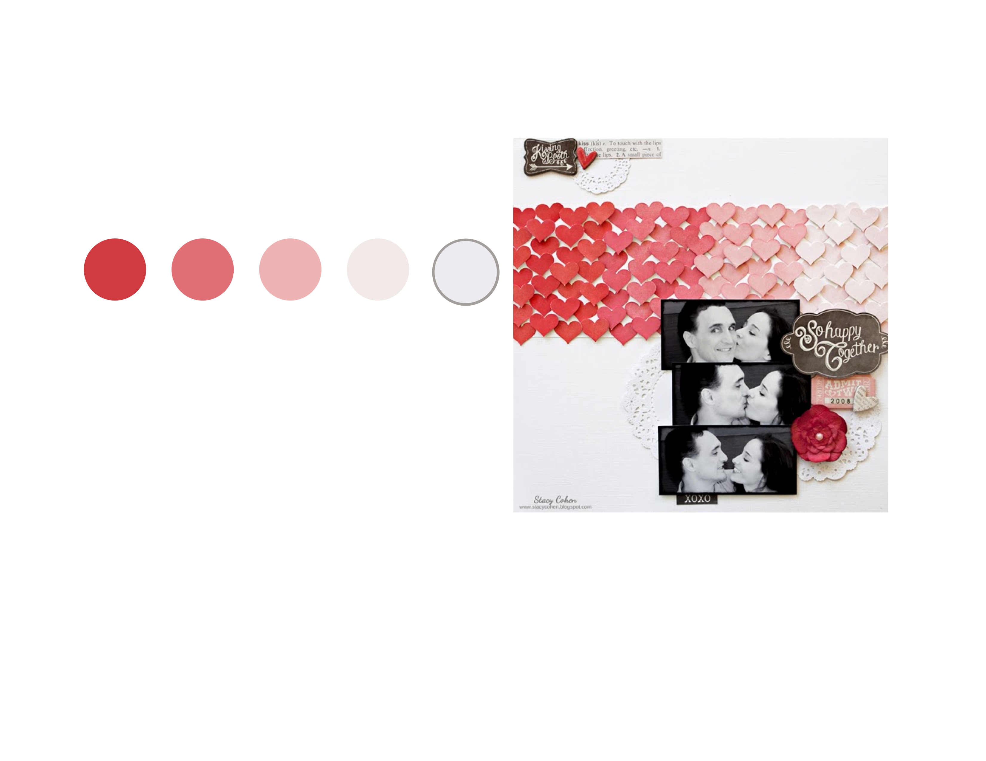
Go monochromatic. Use 3-5 shades of one color on a contrasting background (which creates a beautiful ombré effect, but, again, an odd number, please.) Here are some examples:
|
|
|
|
|
|
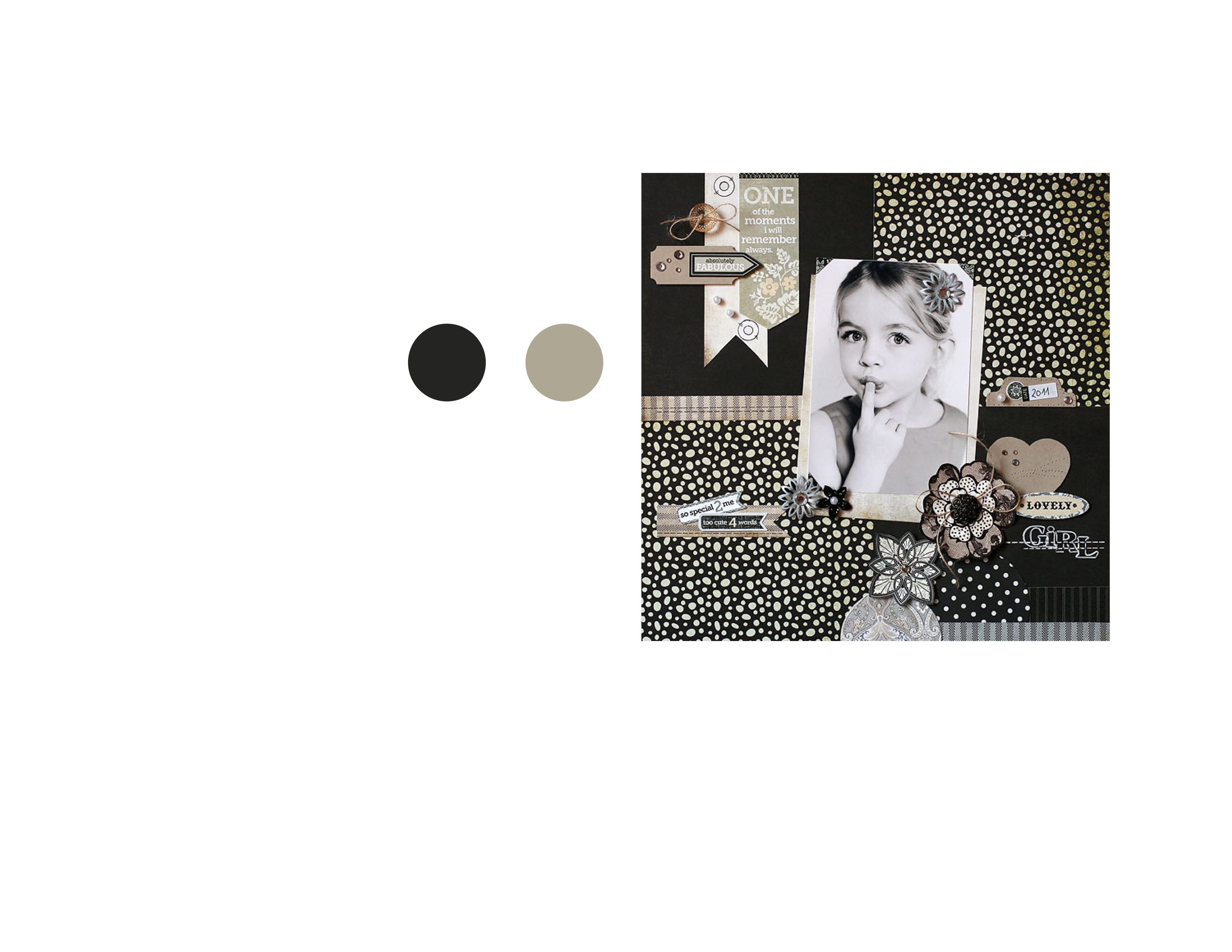
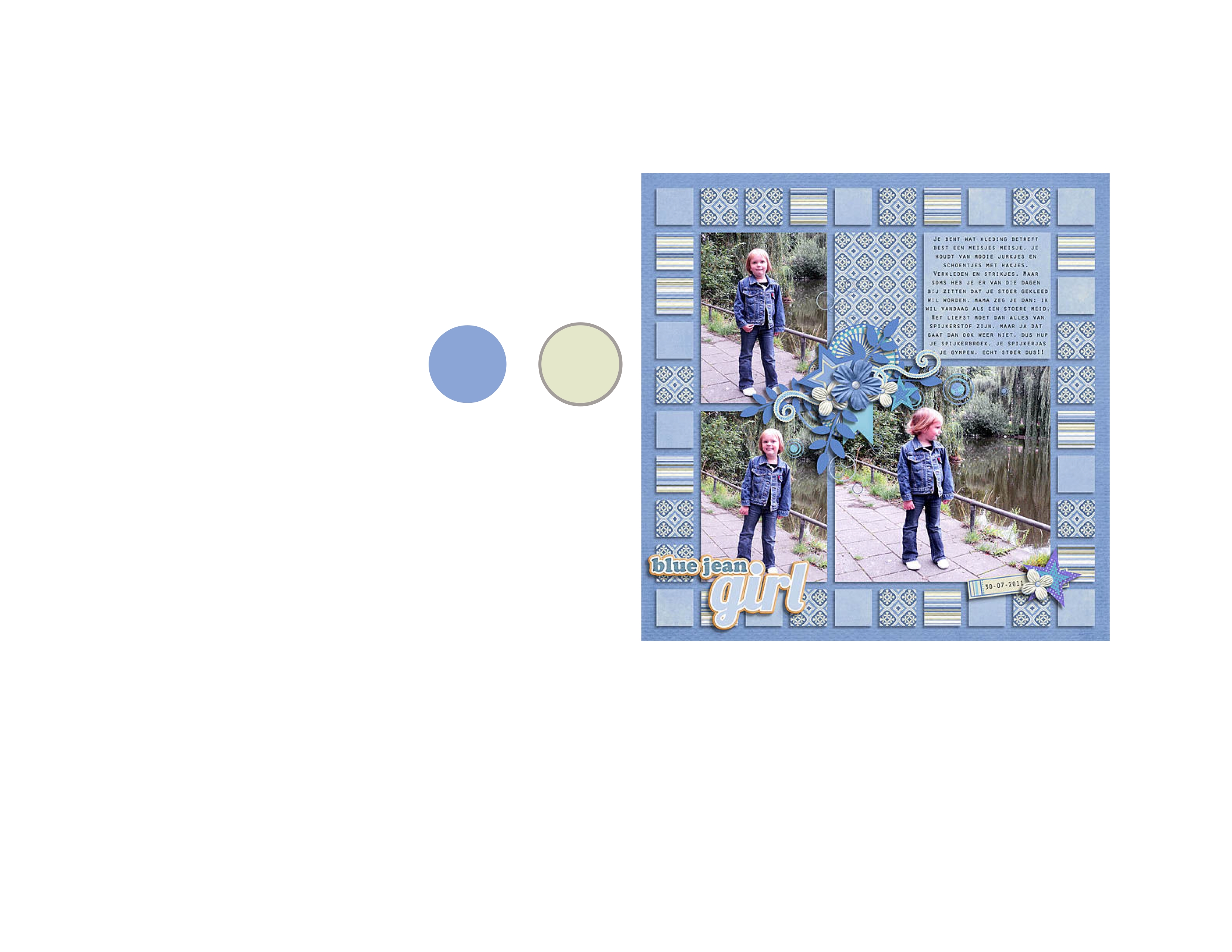
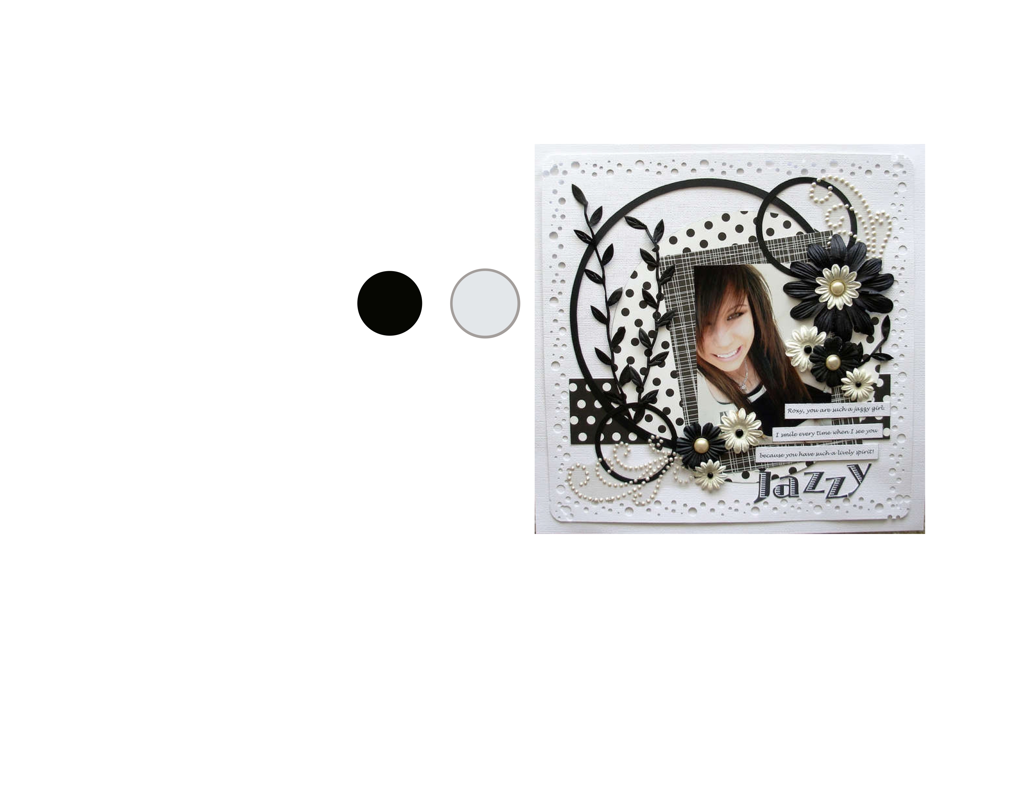
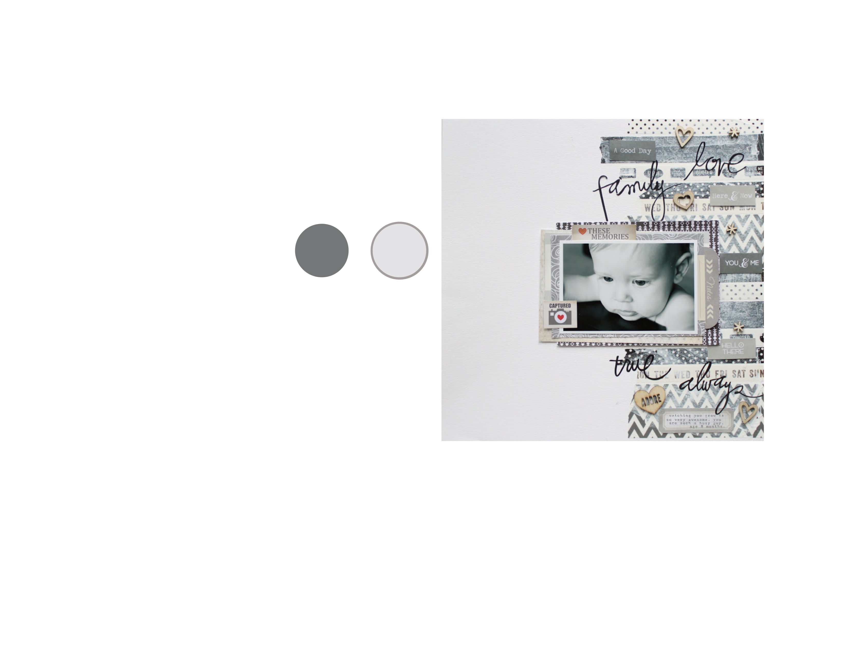
Experiment with contrast, which doesn’t just mean black and white. Look at these great examples with black and taupe; blue and cream; black and gray; and gray and white:
|
|
|
|
|
|
Principle #4: Keep your pictures organized to allow for quick layouts.
If you would like to see our suggestions for photo organization and storage, see our posts:
- The 3 Best Reasons to Print Your Pictures and Keep Them in Albums
- What To Do When You’re Overwhelmed with Your Digital Photos
- Photo Storage Solutions You Never Knew You Always Needed
Principle #5: Think in terms of 4×6 and 3×4 to minimize your decision making or streamline the decision making process.
It just makes the whole thing easier.
See you soon!